Landing Page Examples & Best Practices
Creating a compelling landing page is key to converting visitors into paying users of your white-labeled eCommerce builder powered by store.icu. This guide outlines best practices and includes examples to inspire your design and messaging.
🎯 Goal of Your Landing Page
Your landing page should:
- Explain what your platform offers
- Highlight its benefits clearly
- Build trust with visitors
- Guide users toward a single action (usually a free trial or signup)
🧱 Essential Sections
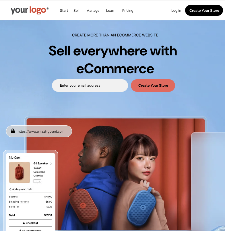
1. Headline
Grab attention and clearly state the main value.
Examples:
- Launch Your Online Store in Minutes – No Code Needed
- Your Brand. Your Store. One Powerful eCommerce Builder.
2. Subheadline
Explain the main benefit in one sentence.
Example:
Create, customize, and launch a beautiful store – fast and without tech headaches.
3. Call to Action (CTA)
Use clear, compelling CTAs above the fold and throughout the page.
Examples:
- Start Free Trial
- Create Your Store Now
- Launch My Shop
4. Product Features
Showcase what your platform does and how it helps.
- Drag-and-drop builder
- Payment gateway integration
- Custom domains
- Responsive design
- SEO-ready templates
Use icons or illustrations to make features scannable.
5. Visual Demo
Add screenshots or GIFs of the builder in action. A short explainer video also works well.
6. Social Proof
Include testimonials, star ratings, or logos of businesses using your platform.
Example Testimonial:
"I built my first store in under 30 minutes. This platform made it easy!"
— Sarah, online boutique owner
7. Pricing Overview
If possible, keep it simple and transparent. Use comparison tables if you offer multiple tiers.
8. Trust Signals
Add these near the footer or CTA:
- "SSL secured checkout"
- "Trusted by 500+ store owners"
- Satisfaction or money-back guarantees
✅ Best Practices
- One page, one goal: Don't distract with multiple CTAs.
- Mobile-first design: Optimize speed and usability for mobile users.
- Fast load time: Compress images and avoid slow scripts.
- Clear branding: Keep colors, logo, and tone consistent with your brand.
- A/B testing: Test different headlines, CTAs, and layouts to optimize performance.
💡 Landing Page Inspiration
Example Layout A: Minimalist SaaS
[LOGO][Headline] [Subheadline][CTA Button] [Product Screenshot][3 Feature Columns with Icons] [Customer Testimonial Carousel][CTA Section with Bold Background]
Example Layout B: Founder-Focused
[Photo of Founder or Business Owner][Story-Based Headline: "How I Built My Online Store in a Weekend"] [CTA Button: "Start Building Your Store Today"][Step-by-Step Feature Explanation] [Pricing Table][Social Proof & FAQ]
Examples
🔧 Recommended Tools
- Page builders: Unbounce, Leadpages, Webflow, or your custom branded store.icu frontend.
- Heatmaps: Hotjar, Microsoft Clarity (to see user behavior)
- A/B testing: Google Optimize or VWO
By building a strong, focused landing page and following these best practices, you'll drive more conversions and position your brand as a reliable eCommerce solution.
Need help creating a landing page layout? Contact Support for templates or design assistance.